
5 Production Design Secrets that worked to bring the 2026 Milano Cortina Olympic Games to Life
- Onni Creative

- Mar 30
- 4 min read

The Winter Olympics are back, and this year they’re taking place in the iconic Italian Alps for a spectacle of sports and culture. The Olympics continues to showcase not just the best in athletics, but sleek, intentional designs that transform venues into global stages. From the ice rinks and ski slopes to the mascots and torches, every visual element has been carefully curated to bring back the traditional images we expect to see with a fresh, unique new take. Check out these 5 production design secrets from the 2026 Winter Olympics that showcase how the creative team revived the Olympic imagery you know + love with classic Italian identity.
PD Secret 1: The concept behind the games
The visuals behind this year's Winter Olympics were driven by energy, creativity, and style. Inspired by human movement and expression, many of the designs we see - the bold colors + dynamic symbols - were created to mirror the passion poured in by athletes and the intensity that runs through the games. This essence was embedded into not just the designs we see on the stages, but also the pictograms created by Brand and Creative Director Raffaella Peniè. His focus on minimalist symbols created with long flowing lines sets these designs apart from the more traditional portrayals we’ve seen at previous Olympics.
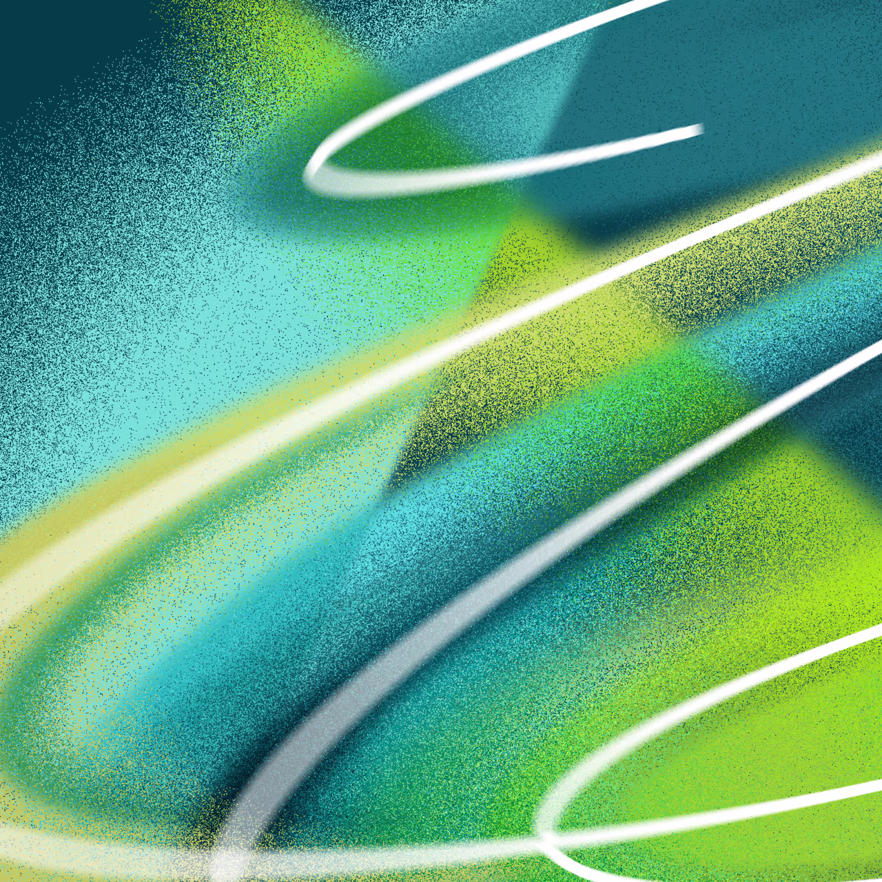
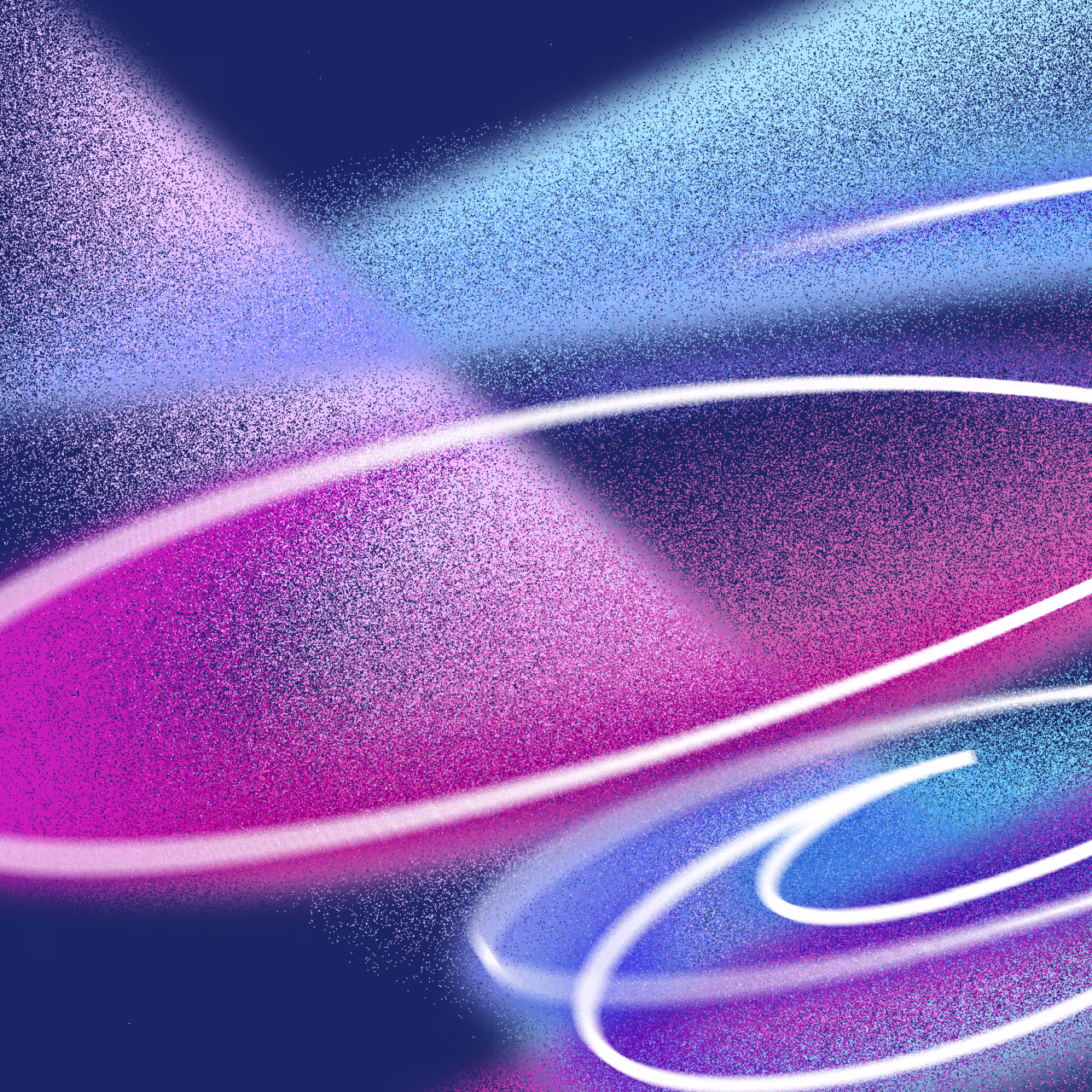
PD Secret 2: Incorporating Armonia into the style

The design team behind the 2026 Winter Olympics focused on incorporating Armonia (Harmony) into this year's designs. In an effort to celebrate Italian artistry, key visual elements included linear, curved, and dotted lines that mimicked typical Italian style while simultaneously mirroring the speed + energy seen throughout the games. These layered graphic systems created a sense of movement across banners, uniforms, and venue installations, blending aesthetics with athletic momentum.
PD Secret 3: The inspiration behind the color palette

This year's designs feature fiery reds, deep blues, and glacial whites with lavender + stone accent tones. The shades were carefully picked out to reflect the colors of the Italian winter landscape while remaining modern + energetic. The logo for the Milano Cortina Olympic Games features an icy white design, while the Paralympic Games logo features greens, blues, and reds - a visual reference to the Aurora Borealis which can be seen from the Italian dolomites.
PD Secret 4: The design of the torches

Architect and engineer Carlo Ratti didn’t solely focus on aesthetics when designing the 2026 Winter Olympic and Paralympic torches, he was also concerned with sustainability. The torches - named Essential - are constructed primarily from recycled aluminum and brass, use bio-GPL gas, and can be reused up to ten times. The Olympic torch is a turquoise shade while the Paralympic version is gold, inspired by the frosty alpine landscape and strength of the athletes.
PD Secret 5: Tina and Milo: this year's cartoon mascots

Cartoon mascots were initially incorporated into the Olympics as a way to market towards children and generate extra revenue. This year's mascots - Tina and Milo - are two sibling stoats named after the two host cities Cortina d’Ampezzo and Milano. Tina is the mascot for the Olympic Games, while Milo is the mascot for the Paralympic Games. Milo was designed as missing one of his paws, and he instead uses his tail as a symbol of the strength and resilience of Paralympians.
Why is production design so important?
A production designer is head of the art department. On board from the beginning, they work with the director + producers to help bring the writer’s script, director’s vision + producer’s plans together as a visual whole. The production designer researches or "scouts" locations, eventually securing + preparing it for shooting. They budget the cost of materials, track expenses, and typically oversee the art director, set designers, illustrators + scenic painters to develop a specific visual style for a production. From minute details to overarching themes, a production designer must consider every aspect shown on screen, regardless of budget, they must be resourceful and think on their feet.
Every two years, we see fresh, intentional designs come out of the Summer + Winter Olympic Games, and this year has been no exception. From the color palettes we see in the venues to the two cartoon mascots, this year's design team has built upon the long-established visuals to incorporate Italian identity, inclusivity and sustainability. In doing so, the Milano Cortina Winter Games demonstrates that production design isn’t just decorative - it plays a part in the narrative. Through the use of human-expression inspired graphics, alpine-inflected tones, and a conscious emphasis on eco-friendly designs, the visual identity transforms sport into spectacle and proves once again that the Olympics are as much a celebration of design as they are of athletic success. Make sure to tune into the 2026 Paralympic Winter Games, starting March 6th, to continue celebrating extraordinary athletes and the striking designs that have brought this year's competition to life.

Written by Olive Pritchard -- Olive is a Marketing Coordinator at Onni Creative. She is passionate about understanding the industry, experiential marketing, and the intersection of culture and storytelling. As well as being a frequent customer at her local movie theatre, Olive loves to spend her free time traveling with friends and reading.
Curious about more production design secrets from your favorite films and TV shows? Dive into our collection of blogs for exclusive behind-the-scenes insights.
Want to keep up with our art + production journey? Follow us on Instagram and TikTok for project highlights, BTS moments, hot tips, and fun content straight from the art department!
Also, be sure to check out our Art + Production Design work! ✨
Sources


